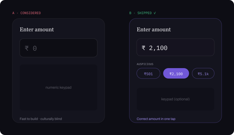
01 Auspicious presets
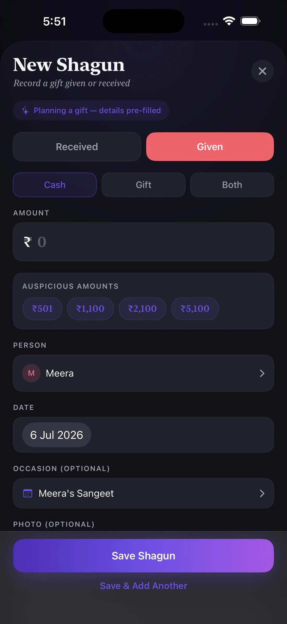
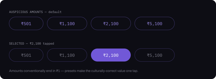
Shagun amounts end in ₹1 by convention, so ₹501 / ₹1,100 / ₹2,100 sit above the keyboard — the culturally correct amount is one tap.
 Piyush Grover
iOS — Personal Product · Live on the App Store
A private ledger for shagun — the gifts and cash exchanged at Indian celebrations — with a reciprocity engine at its heart. Designed end-to-end in Figma, then built AI-directed without writing code.

Shagunly is an iOS app for tracking shagun — the cash and gift exchanges that are a core part of Indian weddings, festivals, and birthdays. Families still track it in paper registers or memory, and generic expense trackers don't understand the reciprocity at its heart — so Shagunly replaces the "who gave what" guesswork with a simple, culturally-native ledger.
The idea came from my father — tech-savvy, and done with the paper registers. He wanted the record off paper and onto a phone, where it could be pulled up in seconds instead of leafed through.
I designed it end to end in Figma — theme, design system, every component and flow — then directed the entire build without writing a line of code. This case study covers both halves: the design decisions, and what it takes to hand a finished design to an AI and ship it.
No formal research phase — this was insight-driven design, grounded in lived experience and validated early with family as real users. Every decision got pressure-tested against one question: would my own family actually use this at a wedding?
It began as a progressive web app, but a PWA has real ceilings here — no App Store presence, weaker offline reliability, a second-class feel for something used one-handed on spotty venue wifi. I rebuilt native in SwiftUI: the kind of build-vs-rebuild call a product designer has to own.
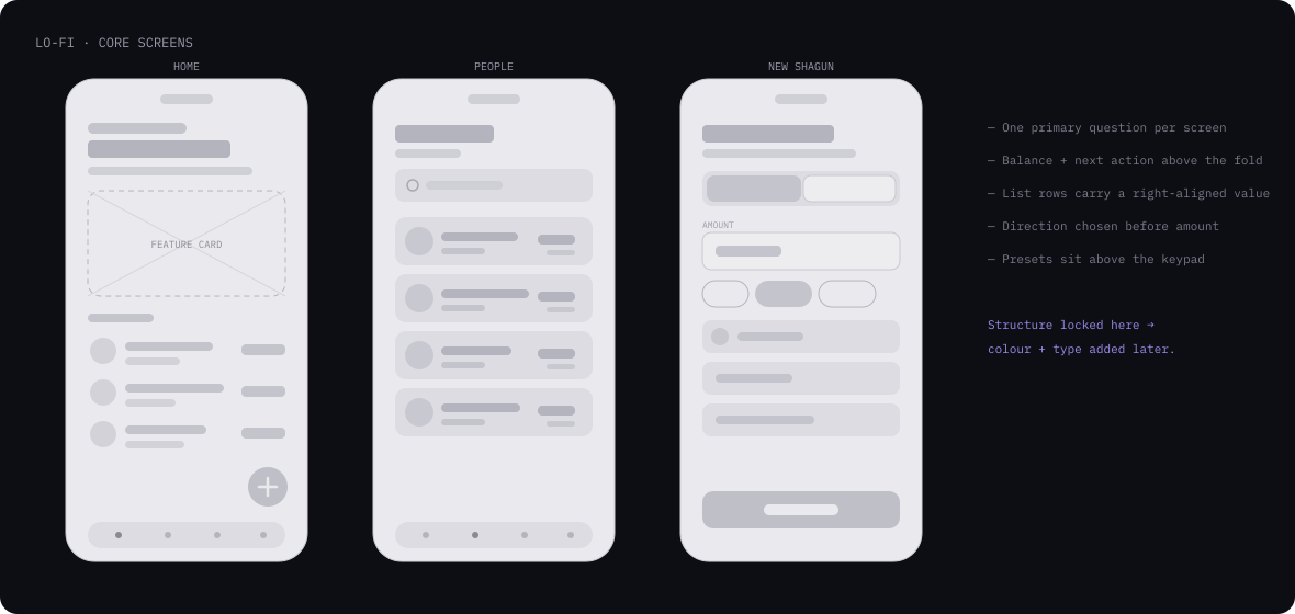
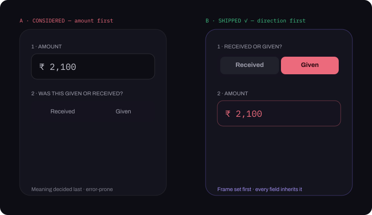
Structure came before style. Layout and hierarchy were resolved as greyscale wireframes first — one primary question per screen, direction chosen before amount. The visual language came later, on top of a structure that already worked.
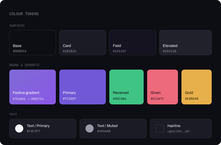
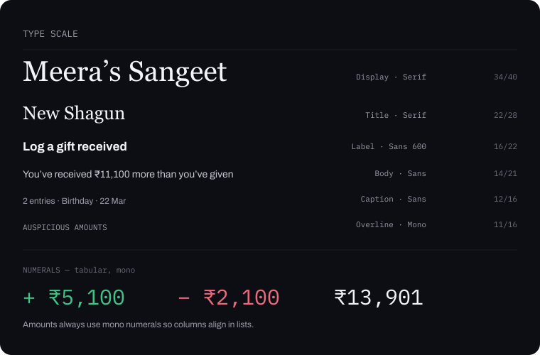
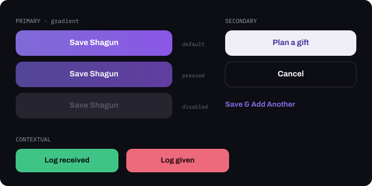
Because I'd be handing this to an AI rather than an engineer, the system had to be unambiguous: every colour, size and spacing step named and fixed in Figma first. Vague intent produces vague code — a defined token set produces the screen you drew. Components followed the same rule, drawn with every state before anything was built.
Two decisions drive the whole palette: a deep night base so celebratory colour can glow without shouting, and a serif display voice that brings warmth to what is, underneath, a money app.
Five screens carry the whole app: Home, People, Occasions, entry detail and capture. Logging a shagun takes seconds — given or received, an auspicious preset, a person, an optional occasion.
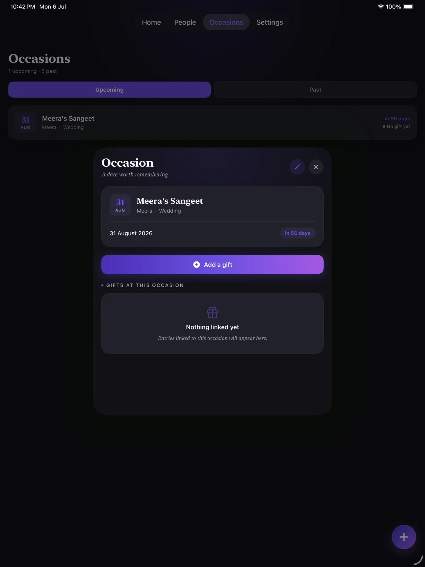
Shipped as a responsive iPad layout too — same flows, adapted to a wider canvas rather than stretched. Explore both below.
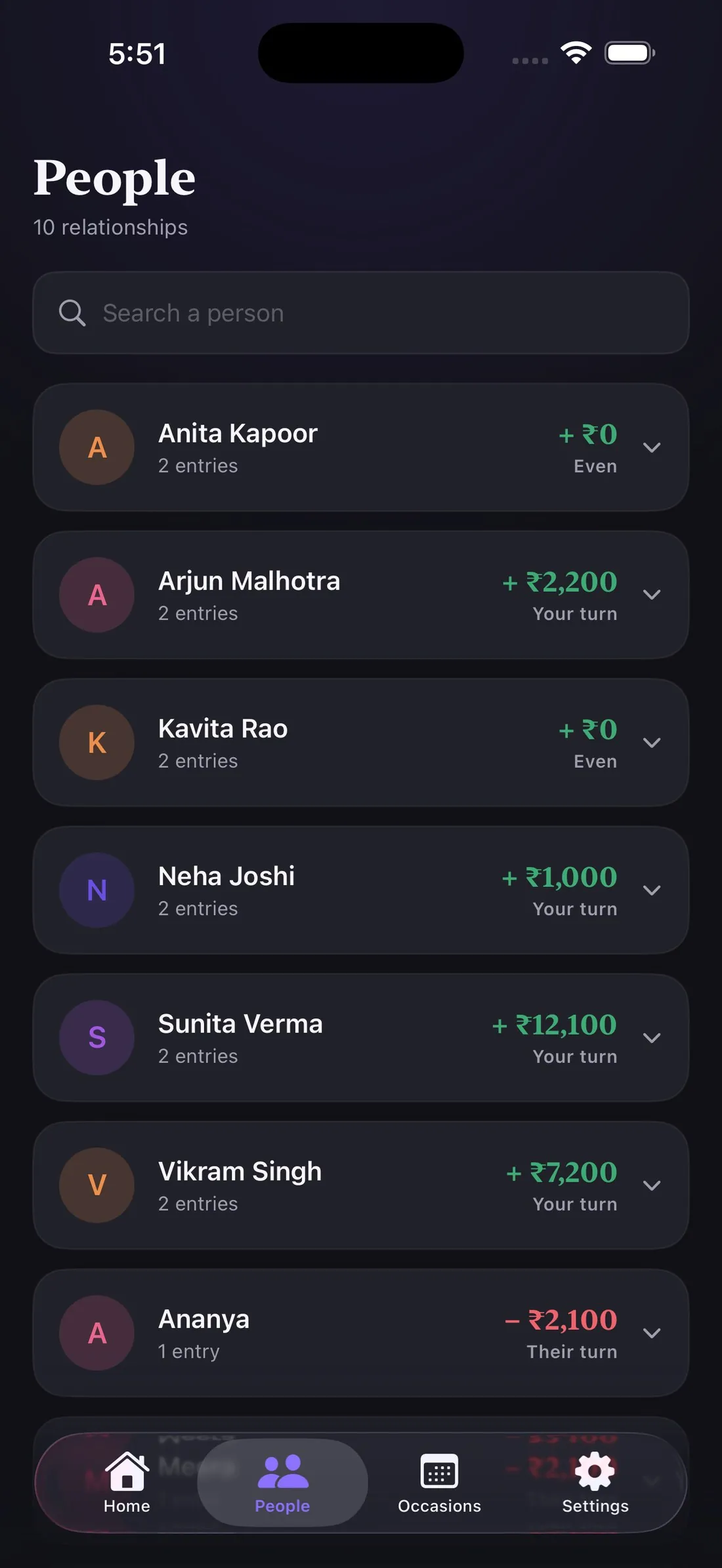
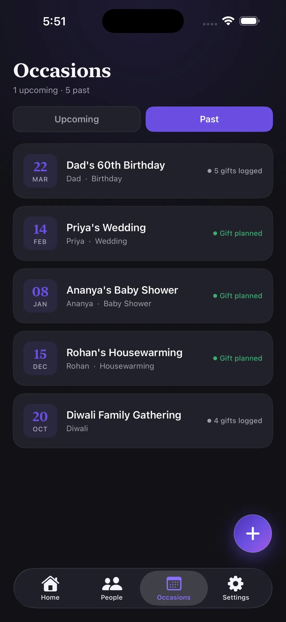
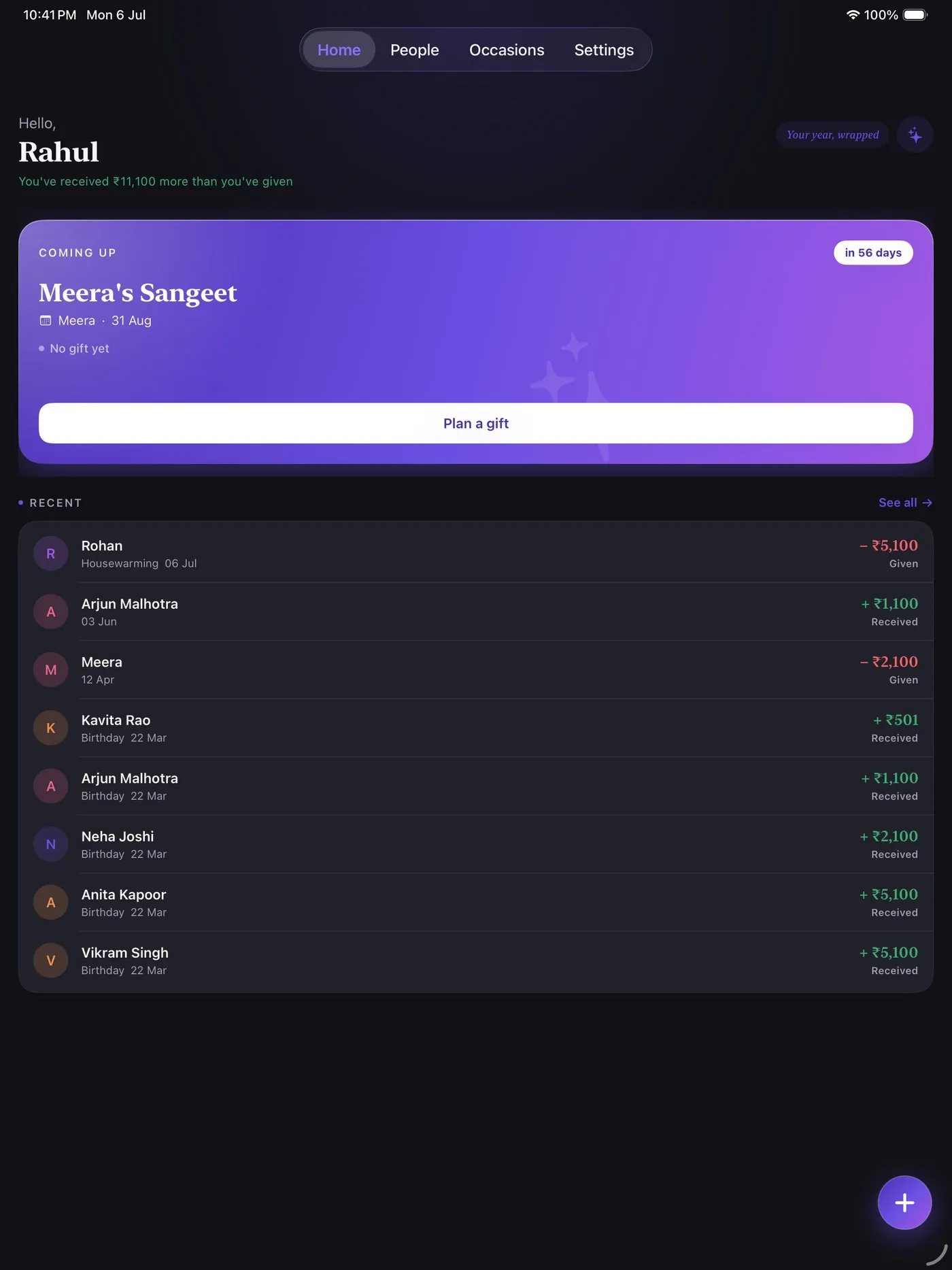
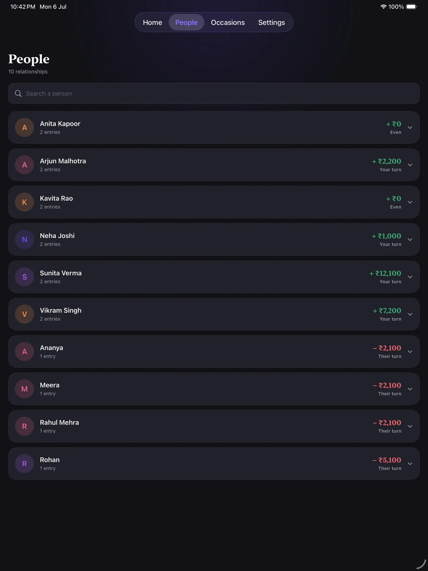
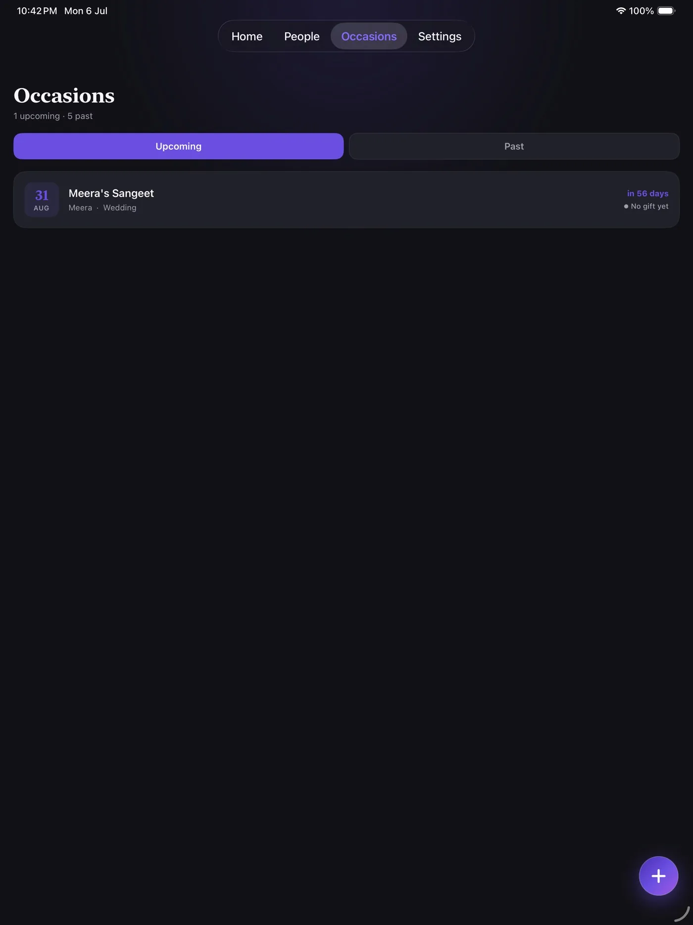
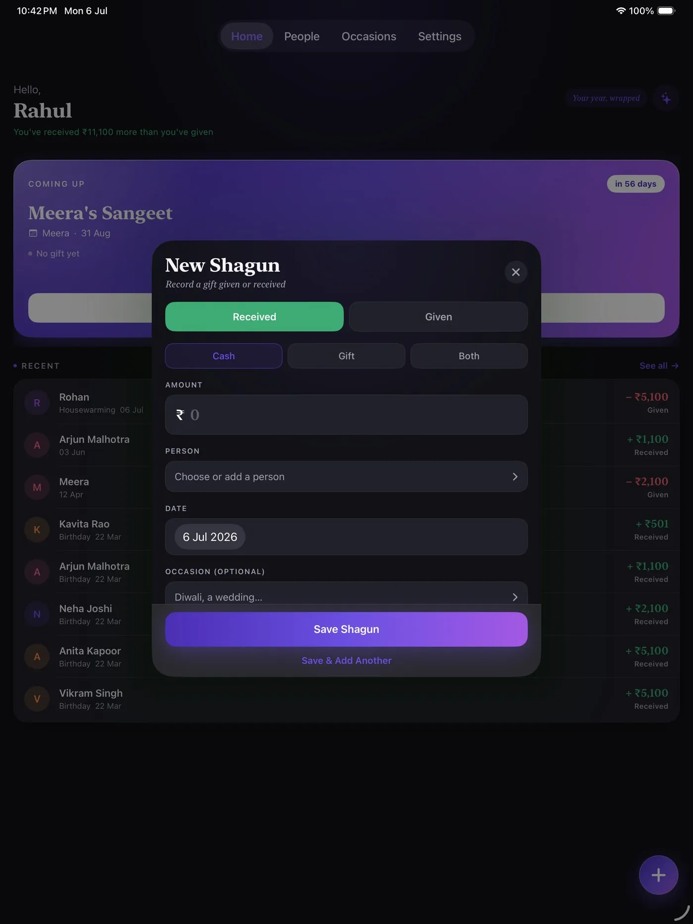
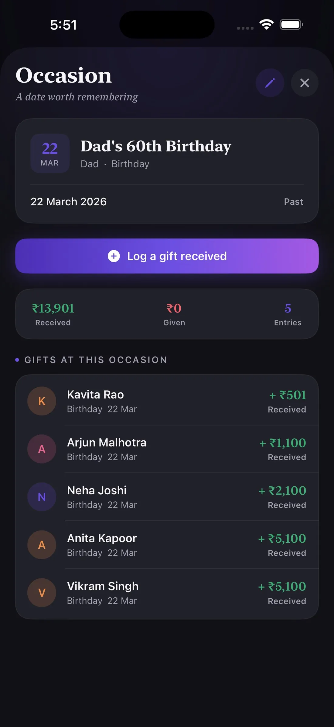
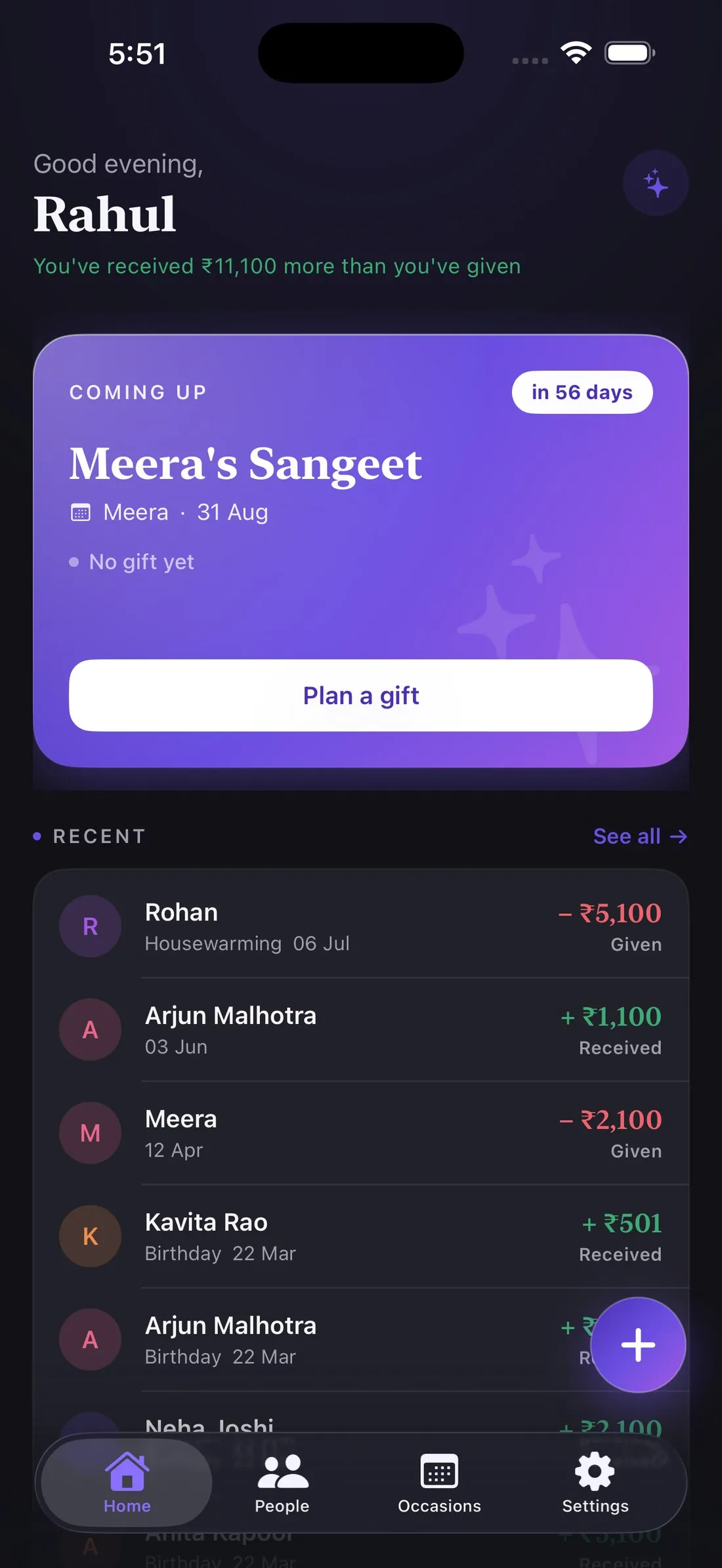
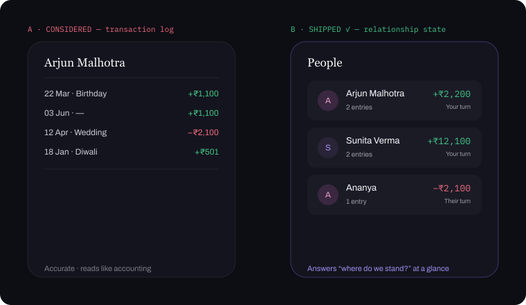
The home screen surfaces what matters first: net balance, the next occasion needing a gift, and recent activity. Every relationship is a running balance, not a transaction log — a glance tells you whose turn it is. Occasions split into Upcoming and Past, each carrying its own gift-tracking status — drilling into one totals what was given and received, and lists every gift logged against it. Logging a shagun takes seconds: given or received, an auspicious-amount preset, a person, and an optional occasion link.
Every screen is the survivor of options drawn out in Figma. The calls that mattered:
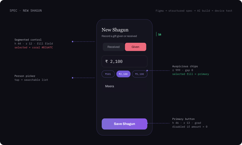
Shagun amounts end in ₹1 by convention, so ₹501 / ₹1,100 / ₹2,100 sit above the keyboard — the culturally correct amount is one tap.
Each person is a running balance with a “your turn / their turn” cue. Shagun is reciprocity, not bookkeeping.
Received / Given is the first, colour-coded choice — it’s the meaning of the transaction, and it frames every field after it.
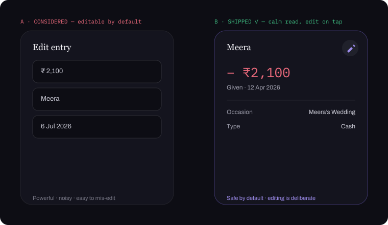
Detail views are read-only; editing hides behind a pencil tap. Most opens are checks — and a crowded function is no place for an accidental edit.
Host Dad’s 60th and gifts flow toward you — marking an occasion “my family’s” flips the whole app to logging gifts received. One boolean, every screen rethought.
A household shares one gift book by code. Only an entry’s author can edit — everyone else can ask — enforced in the UI and again in Postgres row-level security.
No analytics, no ads, no tracking. Export everything in two taps; delete removes it all atomically.
This is the join between the two halves of the project. I redlined each screen in Figma the way I'd spec it for an engineer — component, size, radius, token, state, edge case — and that spec became the brief for the build.
The discipline mattered more here than it would with a human engineer: a person asks when something's ambiguous, an AI just picks. Anything I left vague came back as something I didn't design, so the spec had to carry the decision, not just the look.
Design decided in Figma. The build followed the spec.
I have no coding background. Every screen, flow and backend interaction was built by directing Claude against the Figma spec — describing intent, reviewing output, iterating — the same way I’d direct an engineer. I thought in components and states, not SwiftUI structs.
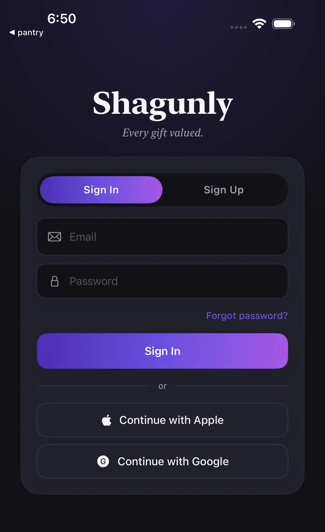
What that produced, not just prototypes: a working auth system with a real forgot-password flow on Supabase, a read/edit view architecture wired into the app’s root navigation, and a build that cleared Beta App Review and then full App Review — tested on TestFlight with family as real external testers along the way.


Swift’s synthesized Encodable omits nil keys, so clearing a photo or a note silently survived in Postgres — the classic PATCH-semantics trap. Fixed with explicit payloads that write SQL NULL on purpose, now across all five mutating tables.
These aren’t things I coded. They’re things I had to understand well enough to direct.
The interesting decisions weren’t about corner radii. Rebuild native or stay web? Strip the paywall or protect revenue during validation? Ship a calm read-only view or a noisier editable one?
Directing an AI didn’t replace design thinking — it removed the bottleneck between making a decision and seeing it live in a real, installable product. The same person who decided what to build also shipped how it works.
Shagunly is out in the world. Get it on the App Store ↗
Next: calendar sync, widgets, a shareable Wrapped card, per-relationship insights, Hindi localisation — and Android, already scaffolded in Flutter on the same backend.